My first experiments with R
I started to use R for a maths course at the Open University, and thought I'd jot down my initial progress. R is pretty ugly to come to as a programming language: as far as I can tell, there is absolutely no naming convention at all. Luckily there's a REPL and lots of people who'll have tripped across similarly confusing things on Stack Overflow.
I decided to use R instead of OUStats, the OU's proprietary stats program (Windows only). R certainly had a longer lead time for me to get useful things out of the data, but at least it's used outside of my course.
The first data set I played around with was the eruptions of the Old Faithful geyser in 2011. I wrote a 3 line Ruby script to mung the data into seconds rather than hour:minutes:seconds, rather than look up whatever naming crimes R requires.
anHour = 60 * 60
STDIN.read.split("\n")[8..-2].each do |line|
  hour, min, sec = /(\d):(\d\d):(\d\d)\D*$/.match(line).to_a[1..-1].map(&:to_i)
  puts (hour * anHour) + (min * 60) + sec
end

# Console

> cat geyser.txt | ruby mung.rb > interval_seconds.txt
From there I used scan to get the data into R, and the summary, sd and mean (rhyme or reason for abbreviating? None) functions got me what I needed, and hist() gave me a creditable histogram.
# R console

> raw = scan("geyser.txt")
> summary(raw)
   Min. 1st Qu.  Median    Mean 3rd Qu.    Max.
   3168    5346    5676    5597    5940    7260
> sd(raw)
[1] 565.0956
> mean(raw)
[1] 5597.049
> hist(raw)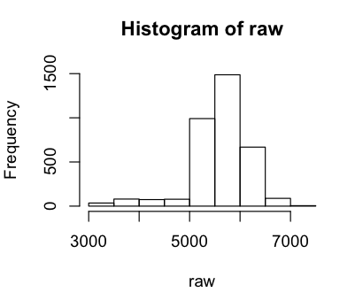
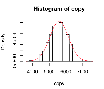
Next I wanted to add a normal curve to the data, to see it fit. It's delightfully simple to do that, as was converting my data into probability density format so that it can be compared to the curve.
> hist(raw,
    breaks=25,                              # more useful than the default chunky 'gram
    freq=F,                                 # probability density please
    col="#F0F7DF",
    main="Old Faithful Eruptions in 2011",
    xlab="Interval seconds",
    ylab="Density")
> curve(dnorm(x,mean(raw),sd(raw)),
    col="red",
    add=TRUE)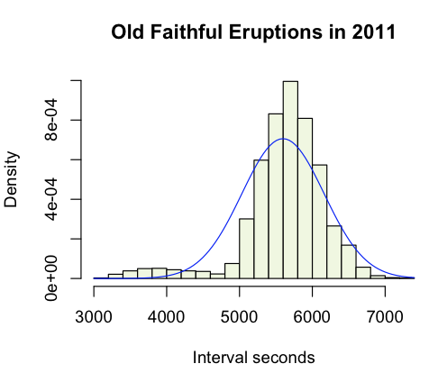
I then set about sampling the normal distribution to see how well it mapped onto the data. I wrote a function that gave me a new sample of the distribution with the same standard-deviation and mean as our geyser data, and visualised it a few times.
> sample = function(list) rnorm(length(list),mean(list),sd(list))
> copy = sample(raw); hist(copy,breaks=25,freq=F); curve(dnorm(x,mean(copy),sd(copy)),col="red",add=TRUE)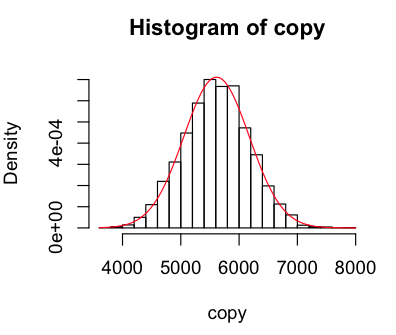
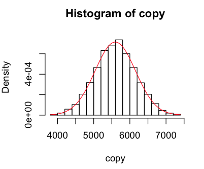
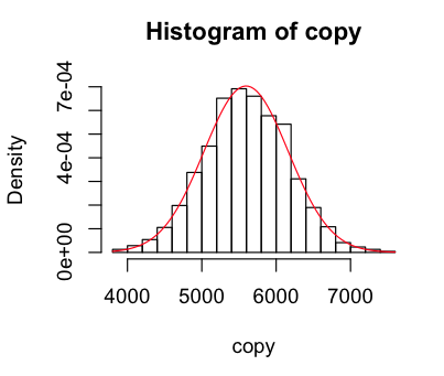
Looks like our geyser is fairly well modelled by the normal curve, but with a higher peak around the mean, a lower than normal observations near close to the mean on the left, and more than normal further from the mean. When I used 100 breaks I got a weird pattern of peaks and troughs that made me recheck my munger (which seems fine), but it looks fine with 25.
The second data set was of pairs of father and son's heights. The data was collected as a frequency table, and this absolutely flummoxed my nascent R usage. Being a statistics ignoramus too, after a couple of hours search for how to carry out basic mean/sd/summary on a table of frequency data I came up with nothing. All the operations seemed to be designed to work on tables where each observation had a single row - so rather than this:
| Father's Height | Son's Height | Frequency |
| 65 | 67 | 3 |
| 66 | 67 | 1 |
I needed this:
| Father's Height | Son's Height |
| 65 | 67 |
| 65 | 67 |
| 65 | 67 |
| 66 | 67 |
I knew from the start I could just convert the data, but I felt R was a DSL for statistics, surely designed /precisely/ to replace imperatively coding statistical functions for common types of data. Well either I didn't look hard enough, or I was wrong. I found helpful pages but my newness to both statistics and R probably means the answer is there in plain sight. Lots to learn.
Anyway eventually I went for the conversion approach, via StackOverflow. The functional aspects of R come out nicely in this kind of conversion, just as the DSL shines in letting you do matrix-y math style operations over vectors.
> pearsonRaw = data.frame(
    fathers=rep(pearson$FatherHt.Frequency,pearson$Frequency), # repeat each height[i] for frequency[i] times
    sons=rep(pearson$SonHt.Frequency,pearson$Frequency)
  )
So once I'd got the data in a format R was happy with I could then hit it with all sorts of fun things from R's toolbox.
> table(pearsonRaw)
       sons
fathers 60 61 62 63 64 65 66 67 68 69 70 71 72 73 74 75 76 77 78 79
     59  0  0  0  0  1  2  0  0  0  0  0  0  0  0  0  0  0  0  0  0
     60  0  0  0  0  0  1  0  2  0  0  0  0  0  0  0  0  0  0  0  0
     61  0  0  0  1  1  1  1  2  1  1  0  0  0  0  0  0  0  0  0  0
     62  0  0  0  2  3  2  2  4  3  0  0  0  0  0  0  0  0  0  0  0
     63  0  0  1  2  4  3  5  4  7  5  1  0  0  0  1  0  0  0  0  0
     64  1  0  1  2  4 10  9 13 10  5  2  3  0  0  0  0  0  0  0  0
     65  1  0  0  3  7 13 10 20 10 14  5  5  3  0  2  0  0  0  0  0
     66  0  0  0  5 10 11 17 26 25 18 18 10  1  1  2  0  0  0  0  0
     67  0  1  0  2  3  8 18 25 31 16 12 11  7  3  0  0  0  0  0  0
     68  0  0  1  1  2  6 15 20 23 25 19 19  7  7  5  1  1  1  0  0
     69  0  0  0  0  1  3  5 13 30 29 22 15 11  7  3  2  0  1  1  0
     70  0  0  0  0  1  3  1 14 13 21 20 20 11  6  3  0  0  1  1  0
     71  0  0  0  0  2  0  3  3  9 10 15 10 11  8  6  2  1  0  0  0
     72  0  0  0  0  0  0  1  1  9  4  6  9  9  6  3  1  1  0  0  0
     73  0  0  0  0  0  0  0  1  2  3  3  5  2  4  3  2  1  1  1  1
     74  0  0  0  0  0  0  0  0  0  0  2  1  1  0  0  1  0  0  0  0
     75  0  0  0  0  0  0  0  0  0  1  1  1  0  1  2  0  0  0  0  0
Pretty cool result even in ASCII.
> library(Hmisc)
> describe(fathers)
     fathers
           n missing  unique    Mean     .05     .10     .25     .50     .75     .90     .95
        1078       0      17   67.74      63      64      66      68      70      71      72

               59 60 61 62 63 64 65  66  67  68  69  70 71 72 73 74 75
     Frequency  3  3  8 16 33 60 93 144 137 153 143 115 80 50 29  5  6
     %          0  0  1  1  3  6  9  13  13  14  13  11  7  5  3  0  1
I then decided to plot this data with the much-vaunted ggplot2. Looking at the scatter plot, it looked fairly friendly for basic stuff. And it was! I plotted the two data-sets as before, but could now change the colour, size or shape of the points depending on their frequency. Yay! I realised as I was done I could do the plotting with the imported frequency table. Still wouldn't have been able to do simple things like calculating means and sd's though.
> pretty = ggplot(pearsonFrame,aes(pearsonFrame$FatherHt.Frequency,pearsonFrame$SonHt.Frequency))
> pretty + geom_point(aes(size=pearsonFrame$Frequency))
> pretty + geom_point(aes(size=pearsonFrame$Frequency,colour=pearsonFrame$Frequency))  # my favourite
> pretty + geom_point(aes(size=pearsonFrame$Frequency))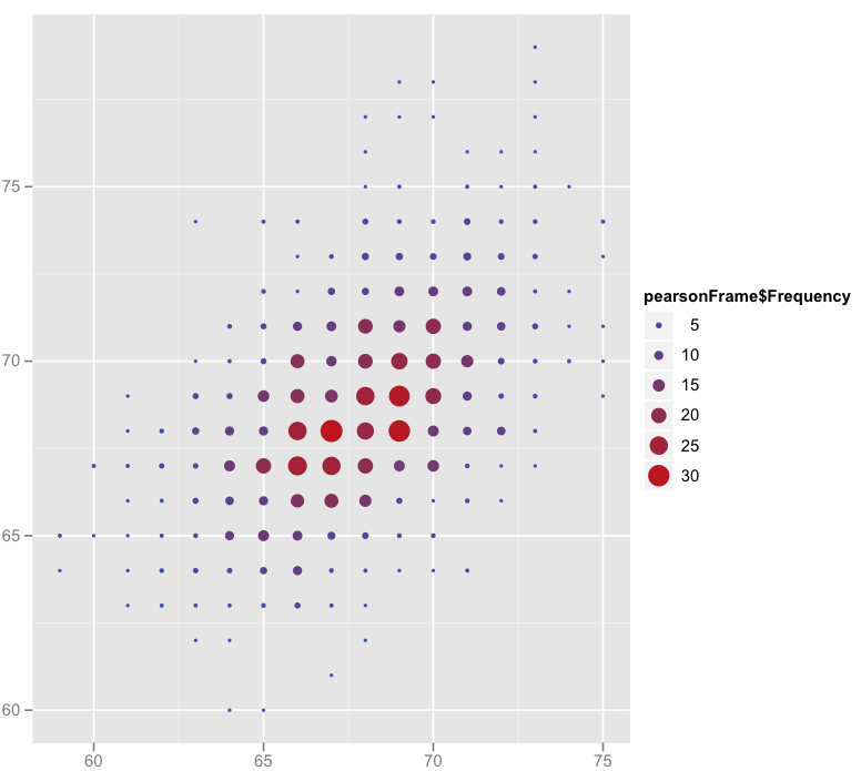
So my first half-day with R was pretty fun. I think the most confusing aspect is where to stop using R as a DSL by looking for the correct function that "just works" for your task, and to start creating your own solutions by using R as a programming language. The simplicity of retrieving basic statistical functions from, and visualising, correctly formatted data makes me want to explore a lot more.