Infographics aren't just pretty pictures
What does the below company (Thames Water) seem to be spending the most on?
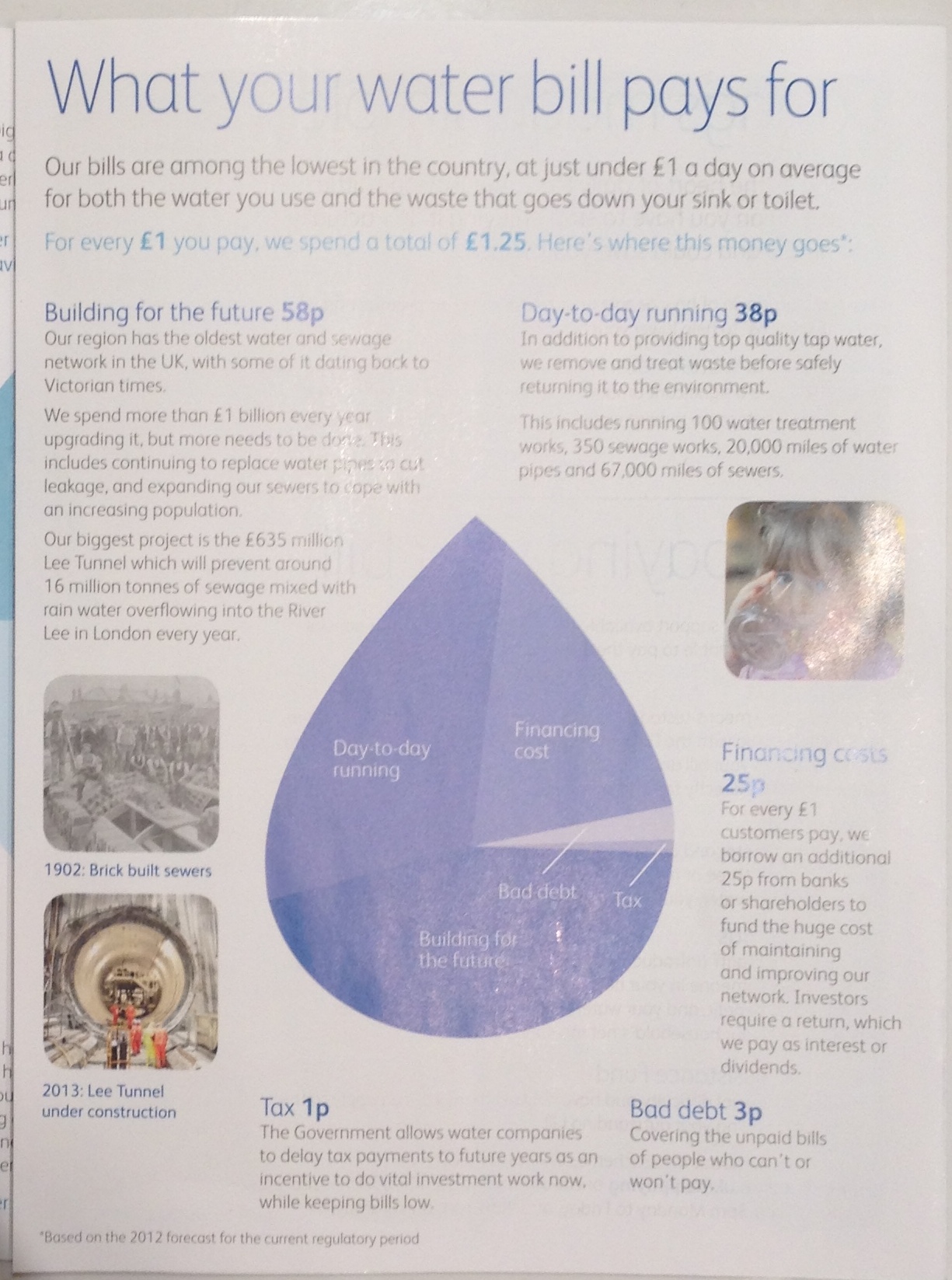
Click to see the actual numbers.
Looking at the area of the shapes in the visualisation suggests the following order:
- Day to day running
- Building for the future
- Financing cost
With probably 10-15% more on 'Day to day running' than 'Building for the future'.
Look at the numbers and it's actually:
- Building for the future 46%
- Day to day running 30%
- Financing cost 22%
So while it was visually 10-20% bigger, 'Day to Day Running' represented 50% less of the real total than 'Building for the Future'! An accurate visual representation would be the below:
The problem is that the pie chart system, where a category that takes 50% of the whole gets 180o degrees and therefore 50% of the area, has been misapplied to non-circular shape. The distortion affects the categories that sit in the non-circular area:

So about 30% of the infographic wasn't information, but noise.
Designers: infographics aren't just there to look pretty: they are there to communicate. Double-check that the message you're sending fits the data!