Improving Sapiens' timeline page
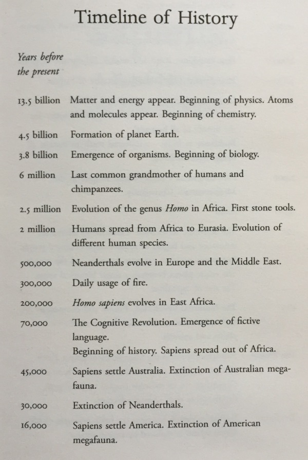
Yuval Harari's book Sapiens includes a timeline before the text. Take a look at it below and consider what you notice in the data with a quick glance:

Nothing really jumps out at me, visually. However, there is a big message that should! The shock here should be that our earliest ancestors are still stunningly young, relative to the earth (and especially to the universe). If the life of the earth so far was a day, that ancestor emerged in the last two minutes!
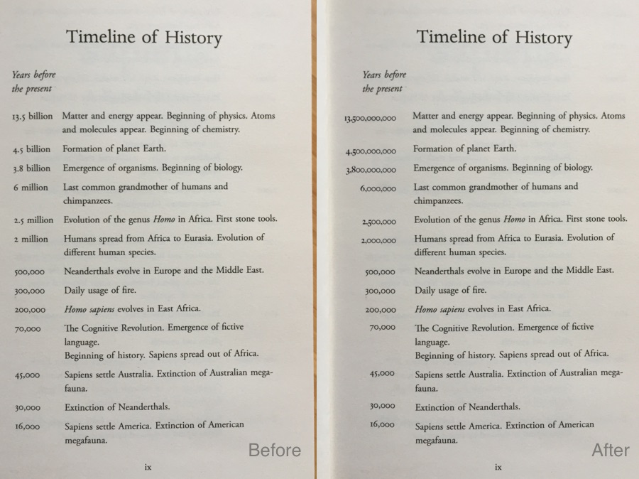
This shock is concealed due to the text-centric way the numbers are formatted, i.e using '13.5 billion' rather than 13,500,000,000. In prose this is great, much easier for most people than having to play 'count the commas'. But when presenting a set of numbers, a numeric representation of the numbers is superior as it makes the huge variance between values visually obvious. Take a look:
It communicates the variance because the typographical length of a decimal number is by definition a visually logarithmic scale. e.g 13.5 billion is 10^10 and thus 11 characters (or 14 with commas), and 6 million is 10^6 and 7 (or 9) characters, so the first is >50% longer when presented as numbers. The word encoding doesn't encode the length visually, so doesn't engage the visual parts of readers' minds to help them understand the data.
Small decisions like this can have a big impact on comprehension when presenting data. It's why I find it vital to understand the story in the data before choosing its representation.

Leave a comment via Github 💬