A pandemic of bubble maps
Besides COVID-19, we have an outbreak of bubble maps failing to communicate data effectively:
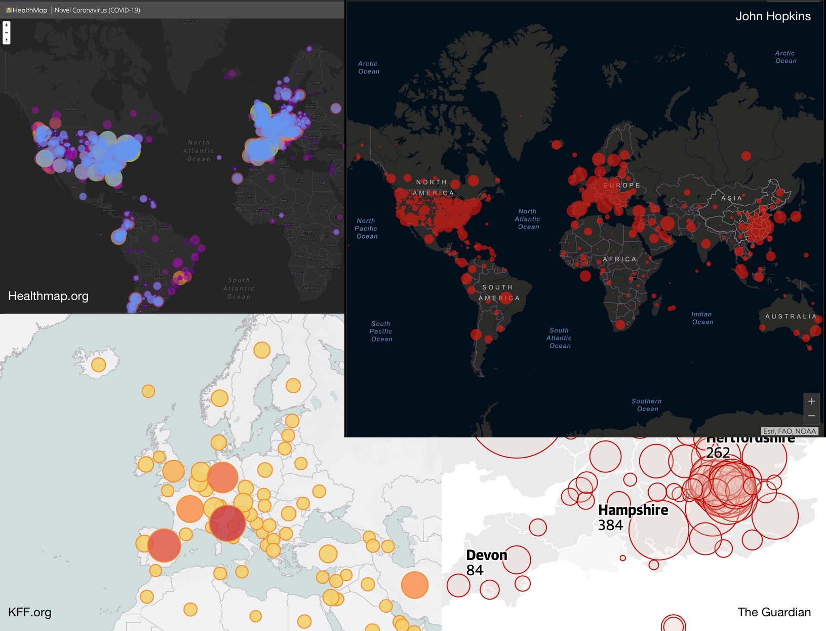
Obviously, the overlapping is absurdly unreadable. But even if fixed, experts (e.g Tufte) agree: circles are a poor way to communicate relative magnitude. Firstly because we suck at judging differences between values encoded as the areas of shapes. Secondly because we especially suck at judging the relative area of circles.
If you’re attempting to communicate important data, rather than designing attractive wall art, please use a colour ramp (ideally scaled by population). That is a one dimensional encoding of one dimensional data, and it’s much easier to judge.
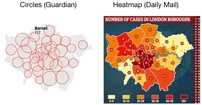
Compare: which of the following charts communicates where more cases have occured in London?
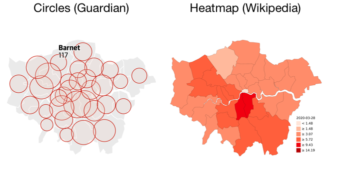
Journalists would be better off simply republishing Wikipedia’s images, or building on them. And out of The Guardian and The Daily Mail, I’m sorry to say the evidence suggests the Daily Mail better understands how to communicate data:
Citations
The use of two (or three) varying dimensions to show one-dimensional data is a weak and inefficient technique, capable of handling only very small data sets, often with error in design and ambiguity in perception. These designs cause so many problems that they should be avoided.
bar figures give the most accurate comparisons, the circles and squares less accurate
Leave a comment via Github 💬